

“Who’s your beauty standard in person?”
“ME”
Collab in Motion
Collab in Motion
Collab in Motion
Branding \ SAKASpace — 2017
Branding \ SAKASpace — 2017
Branding \ SAKASpace — 2017
SAKASpace is a production studio in Indonesia that offers collaborative audio-visual-based projects with end-to-end services. Dedicated to providing the best creative solutions, SakaSpace optimizes audio-visual experiences. Its clients range from multinational established companies to local startups (e.g., Dunhill, Blibli.com, Tolak Angin, etc.).
SAKASpace aims to have a brand identity fully representative of its DNA as well as its collaborative nature in the audio-visual field. Inspired by the movie projection device, we shaped the SAKA characters to be seen as a reliable platform for projecting A-Quality audio-visuals. Utilizing the typography of its name, SAKA, we created a dynamic logotype through the extended light from the 'K'. This visual system aims to support their ever-changing needs and opportunities in the future.
Brand Workshop Summary
Brand Workshop Summary
Brand Workshop Summary
Branding activities to support the business:
Representative of SAKA's identity, it supports its perceived quality as a reliable choice within its category. Hence, we showcase SAKA's visual identity in a solid, minimalist, modern way, instead of a more playful one—infused heavily with a dynamic identity system to promote opportunities for collaborations.
Branding activities to
support the business:
Representative of SAKA's identity, it supports its perceived quality as a reliable choice within its category. Hence, we showcase SAKA's visual identity in a solid, minimalist, modern way, instead of a more playful one—infused heavily with a dynamic identity system to promote opportunities for collaborations.
The 'A' Projector
The 'A' Projector
The 'A' Projector


The Brand Identity
The Brand Identity
The Brand Identity
We view SAKA's character as a destination for brands in need of low-risk, reliable hands to solve their audio-visual projects.
We use Extended Sans Serif to maintain its minimalist, modern, and solid character with a spark of edginess. The projection conveys a dynamic sense and can be extended to showcase its services.
Key Visual
Key Visual
Key Visual
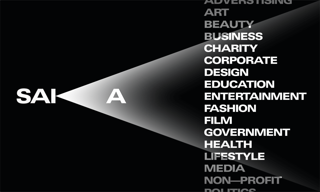
We came up with an idea of showcasing their range of industry, seen through accented spotlights. To raise awareness of SAKA’s services, this showcase combines a sense of confidence and dynamic functionality into one aesthetic visual.
We came up with an idea of showcasing their range of industry, seen through accented spotlights. To raise awareness of SAKA’s services, this showcase combines a sense of confidence and dynamic functionality into one aesthetic visual.
We came up with an idea of showcasing their range of industry, seen through accented spotlights. To raise awareness of SAKA’s services, this showcase combines a sense of confidence and dynamic functionality into one aesthetic visual.
We came up with an idea of showcasing their range of industry, seen through accented spotlights. To raise awareness of SAKA’s services, this showcase combines a sense of confidence and dynamic functionality into one aesthetic visual.

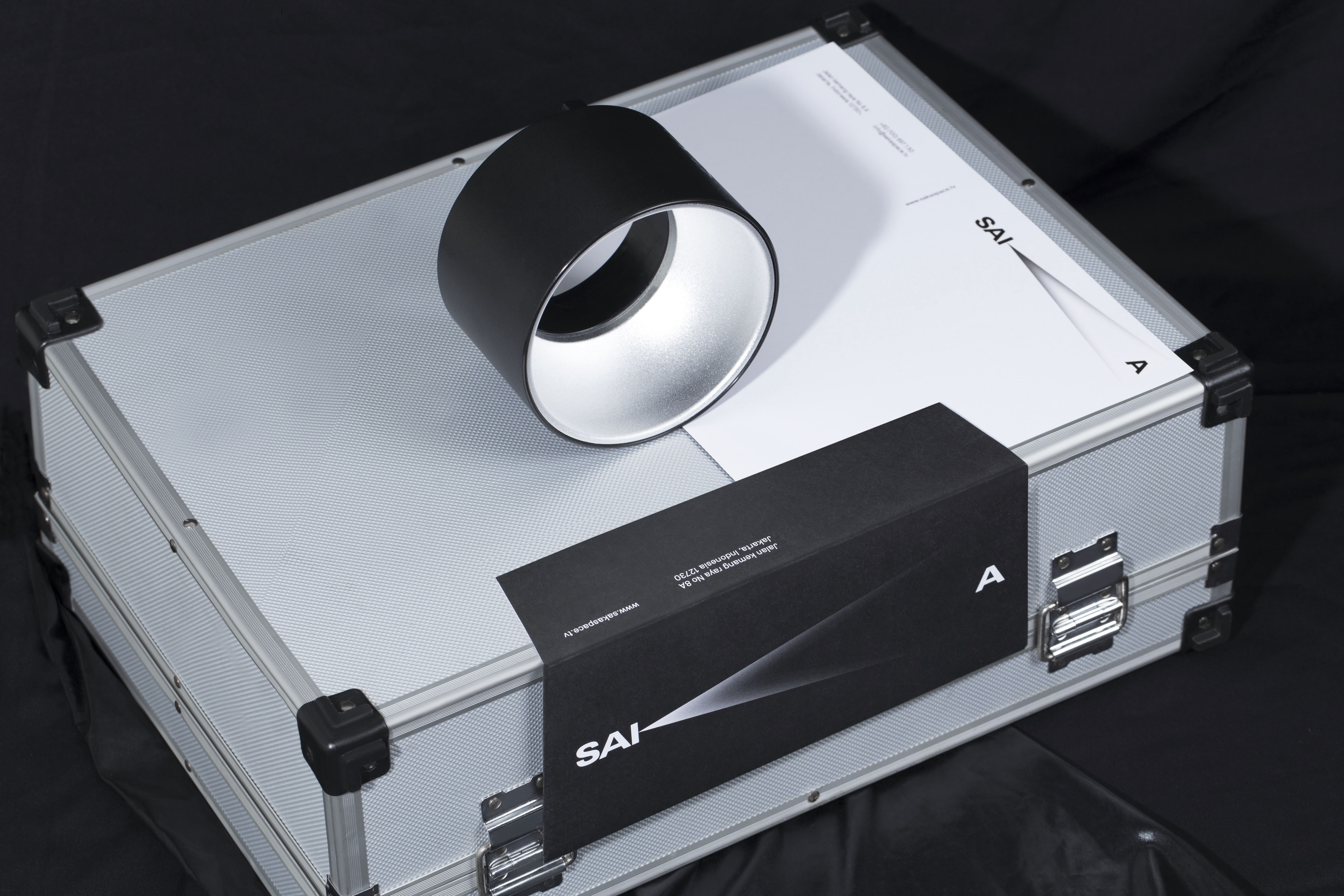


SAKA Space
SAKA Space
Fahmi Siddiq
Fahmi Siddiq
\\'
\\'
Sisiana Pradita
Sisiana Pradita
Wildan Ilham
Wildan Ilham
Photography
Photography
Dimas Danu Wihardja
Dimas Danu Wihardja
Ivan Adhitya Multriadi
Ivan Adhitya Multriadi
Stephanus Mering
Stephanus Mering
Syarif Hidayatullah
Syarif Hidayatullah
Ulfaah Nurzaakiah
Ulfaah Nurzaakiah
\\'
\\'
\\'
\\'
\\'
Resonant Strategy Expertly Executed.
Resonant Strategy Expertly Executed.
Resonant Strategy Expertly Executed.
Resonant Strategy Expertly Executed.
Resonant Strategy Expertly Executed.
©2025—Indonesia
©2025—Indonesia
©2025—Indonesia
©2025—Indonesia
©2025—Indonesia
Jakarta
Jakarta
Jakarta
Jakarta
Jakarta
↦
↧
↧
↧
↧
↦
↧
↧
↧
↧